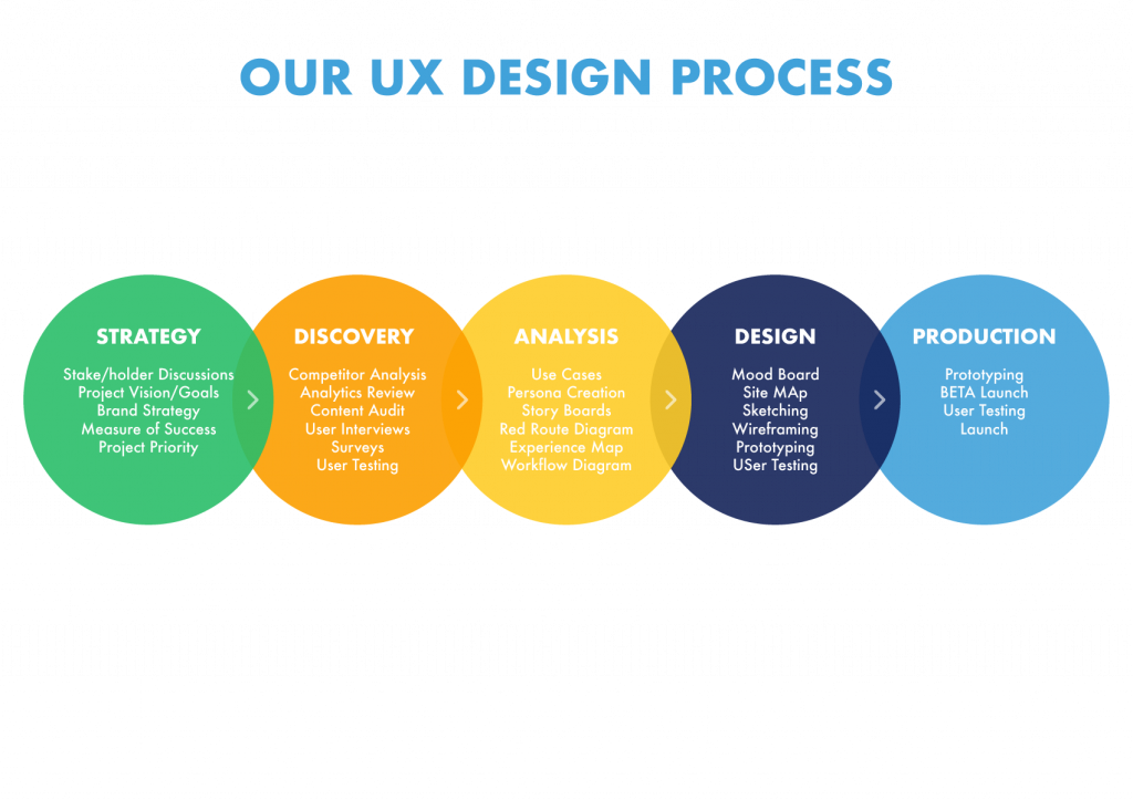
UX strategy
5 UX strategy i follow when building user-centered products.
https://productdesigninterview.com/?aff=7
1. Stay user-centered
Many companies get caught up in designing products with their own preferences or profit goals in mind. While setting goals for ROIs and total revenue is important, keeping the user at the forefront of your UX strategy is key. An effective UX strategy contains plenty of data about your user, their current and future needs, their perception of your brand, and any plans for continued user research.
2. Define your business strategy
Once you have a good understanding of your user, you can start to combine user experience goals with overall goals for the business. Are there financial targets the organization wants to hit? Can employee satisfaction and efficiency be maximized? What improvements in company process, structure, culture, and performance can be made? How can we make them? These are all examples of questions to ask when defining business objectives within a UX strategy.
3. Consider all aspects of the user experience
Optimizing a user’s experience with a product is paramount, but it’s just as important to take a holistic approach and consider all of the touchpoints a customer has with a brand. A UX strategy that can give thought to what happens before and after a user interacts with the product can often lead to more satisfying user experiences and better overall brand perception. Additional user touch points include things like advertisements and marketing, purchasing processes, customer service support, and even service termination.
4. Keeping goals specific
The more specific your goals, the easier it will be to ascertain when they’ve been met or not. It will also be easier to track how effective your UX design team is. So, instead of vague goals like “increase user engagement,” aim for a more specific target: “A 20% increase in both mobile and desktop user engagement.” Furthermore, staying specific with your proposed research methods, marketing strategies, and overall plan of action keeps team members focused and working efficiently.
5. Optimize for speed and accessibility
https://uxdesign.cc/designing-for-accessibility-is-not-that-hard-c04cc4779d94
While every UX strategy should be specialized to the individual organization, most all companies should keep speed and accessibility in mind. Speed highly affects a user’s experience and should therefore have high priority in your UX strategy. Consumers today like things fast and will judge the quality of a product or service on how quickly and smoothly it operates. Additionally, while your designs should be tailored to your main user persona, it’s important to keep accessibility guidelines in mind so you aren’t shutting out any potential users.
Steps
- Learn about User
- Determine features
- Brainstorm solutions
- Stimulate user experience
- Validate with Users


A problem solver, cognitive with an Visual Eye having understanding of design principles following Agile Method.
Agile practice that promotes continuous iteration of development and testing throughout the software development life cycle of the project. Both development and testing activities are concurrent unlike the Waterfall model.
Using 3 design principles ( Fitts law which is a placement or composition of elements, Mimicry which is a reference from something from real-world and aesthetic is to make it visually appealing
Discover — Building Strategy
Method: Why, What, How, Who, Where
Empathize- Learning about the user demographic
(Understanding Problem/Research)
We are trying to solve discovery of larger group or community and their problem and how we can solve as per their capability ( users goal and objective )
Define- Define Scope of Work
Research User Demographics and Business Demographics
( Meet, Talk, Observe.) (Defining the problem)(WHY we need this?) Analysis- Interviews ( Mind Mapping), to remove our assumptions., Functions,Competitive analysis — Evaluating existing task flows, Task Analysis- Proposing new task flows. Need to define the technology.
What is Demographics and where we use it? — Qualitative Questionnaires , User Persona Study of 2 Different frequent and Odd
— Empathy mapping on odd and Frequent characters (Think and Feel)( Say and Do)( Hear ) (See )
— Pain and Gain

Quantitative method? Who, What, Where and When?
- Which can be counted or measured by asking question to focus group with getting the task time by methods like card sorting
— 20 users, Tree testing- 50–100, eye tracker 40 users

Qualitative method? Why and How?
- Which is change and observe through tangible field study on everyday activity. its an iterative process
Ideate — Creating the structure through storyboarding and creating User journey with odd and frequent Persona study, User Flow , Card Sorting and Information Architecture.
What — (generating ideas), solution- how will the pieces fit together, Draw sketch ( Low-Fi ), visualize- Creation of Information Architecture — Defining Navigation ( Card sorting )Evaluating current and proposing new architecture
- User Journey through (Entice, Enter, Engage, Exit and Extend)
10- Usability Heuristic PrinciplesHeuristic Evaluations
Gestalt principles
Asking the right Questions?
- Why does our brand exist?
- Which Domain or Vertical we are focusing?
- What future the brands want to create?
- Have we analyzed that future?
- How we create value to user?
- Brief about the process of the company product deliver?
- Who are the competitors?
- Any specific Age group?
- Devices to be used?
- Goals / Frustrations / Motivations
- SEO, SEM, social media, content marketing, paid acquisition campaigns, PR, email marketing
- Analyze your target users, set a goal for the campaign, and add viral elements.
A Fixed Width and Fluid Website Design
- Fluid fills up the screen
- Fixed Stays right in the middle
Designing for Web Accessibility
- Enabling users with disability to perceive tools and services without barrior
https://www.w3.org/WAI/tips/designing/
- Provide sufficient contrast between foreground and background.
- Don’t use color alone to convey information.
- Ensure that interactive elements are easy to identify.
- Provide clear and consistent navigation options.
- Ensure that form elements include clearly associated labels.
- Provide easily identifiable feedback.
Example of permanent, temporary and situational disability

Q- My Design Best Practices?
A- -Words, Declutterness, clarity
- Validation
- Testing, Being humble, Delight users.
- Words: People don’t read
- Write with your heart and edit with your brain
- Consistency is the key
- Sorting the content on priority
- perfection is achieved when there is nothing left to take away
- Reduce the users effort
- 100 clear screen is always better than 1 cluttered
- Smooth user journey without any confusion
- Ego kills design, It stops Learning and is the biggest enemy of design
- Never be satisfied , become mindful and honest
- it is not for us it is for users
- Whitespaces
- Connecting feelings with features
Usability is an important quality indicator for interactive IT products/systems. It refers to the degree to which products are effective, easy to use, easy to learn, efficient, fewer errors and satisfying to users. Usability is mainly about the functional part of the product. In a word, “Don’t make me think”. Remember, stop making usability mistake as they can kill your website conversions.
https://medium.muz.li/10-tips-on-how-to-conduct-a-perfect-heuristic-evaluation-ae5f8f4b3257
https://www.youtube.com/watch?v=iIQVRzatb50&list=PLJOFJ3Ok_idtb2YeifXlG1-TYoMBLoG6I&index=10
FREE 6+ Sample Heuristic Evaluations in PDF | MS Word
You can use the heuristic evaluation forms provided on this page to conduct this assessment, and hopefully by the end…

Design and Implement — ( Low and High Fidelity )
Activities: Draw paper Sketches, white board flows, Low-Fi Wire frames to share ideas with stakeholders using 3 design principles ( Fitts law which is place of elements, Mimicry which is reference from something from real world and aesthetic is to make it visually appealing
Heuristic Evaluations
Gestalt principles
- Implement: building functionality by tech team.
Activities: Implement back-end functionality
Outcomes: Developed UI with complete functionality and experience following the designed theme and style
- Evaluate: Validating User Flows
- In ter action: ongoing action between the parties. relationship with any humans or object
Activities: Validating user flows
Outcomes: User Feedback, UI Audits, Improvement areas
Few Trending Fonts:
http://www.typevibes.com/
Awareness of trending pairing fonts
serif ( With End Strokes- Times new roman): Rockwell, Sabon, Jura, Brela, Cormorant, Crimson text
sanserif ( Without Strokes- Arial): DIN 1451, Proxima Nova, Montserrat, Nunito, Ui Sans, Open sans, Segoe UI, Moon, Coves, Big john, Slim John, Baron, Aqua Grotesque, Dense
To pair the fonts We need to take care of the Type faces, Contrast with Serf and Sanserif,
Likes:
Bebas neu bold with montserrat.
Open sans extra bold / Cooper hewitt
Raleway/ Roboto
Sefon/bebus neue
Anton/Opensans light
- For Kiosk displays, any sans serif font(IBM Plex Sans, Roboto, Open Sans, Cairo Black, Rajdhani, etc)
Where do i take colors for my designs?
I Prefer something from real world.

- www.paleton.com
- https://htmlcolorcodes.com/color-picker/
- Found an article you may be interested in:
https://digitalsynopsis.com/design/2019-color-trends-worlds-most-popular-colors/
Test


GA, A/B testing, Use Case scenarios, task based, Usability testing
- Where are your users mainly coming from?
- Which section do the users stay the longest?
- Which areas on your page are getting the most clicks?
- Which parts can be optimized and which can be ignored?
- Manual Testing by observing the user by giving a task and tracking the duration
- Heat map by few tools like crazyegg similar to GS
- Eye tracking — WebEyeMapper and WebLogger , HotJar, Maze
Tools Used:
Microsoft invisio and Flow map, XMind, Mindomo, etc.
Sketch, Figma, XD, Balsamiq, Invision, Zeplin etc.
Upgraded with Adobe Suite-Illustrator, Photoshop, Afinity, Max, Maya etc.
Advanced animations, be it via CSS, JS, video or 3D Browser Engines,After effect
Testing Tools: Crazyeggs, Manual testing,
8 Ways to Perfect Your eCommerce Site’s Navigation Interface
- Be Mobile Friendly
2. Adhere to Established Design Conventions
3. Design Immersive Top Level Navigation
4. Use Literal Labels
5. Make Subcategories Cross-Navigable
6. Soup Up Search Options
7. Offer Relevant, SEO-Focused Content
8. Mention Timely Sales Promotions
Industry Standards
Apple Design standards
https://developer.apple.com/design/resources/
Google Material Design standards
https://material.io/design/guidelines-overview
Material is a design system created by Google to help teams build high-quality digital experiences for Android, iOS, Flutter, and the web. Material is an adaptable system of guidelines, components, and tools that support the best practices of user interface design. Backed by open-source code, Material streamlines collaboration between designers and developers, and helps teams quickly build beautiful products.
Clarity provides design assets that help designers get started. These assets should be used in a design process that aligns with the Clarity Design System. To jump start your project and align with the Clarity Design System you should download the font resources below and have them installed on your computer. Set up a free tier Figma (opens new window)account to get started with the Clarity themes, icons and color libraries.
https://www.lightningdesignsystem.com/
Ready-to-use HTML and CSS UI elements provide the foundation for Salesforce experience development
Visual design values and attributes that ensure branding and UI consistency at scale
Design principles and best practices that guide beautiful, consistent, user-friendly product experiences
Easy-to-use tools help all Trailblazers optimize workflows and bring Salesforce ideas to life